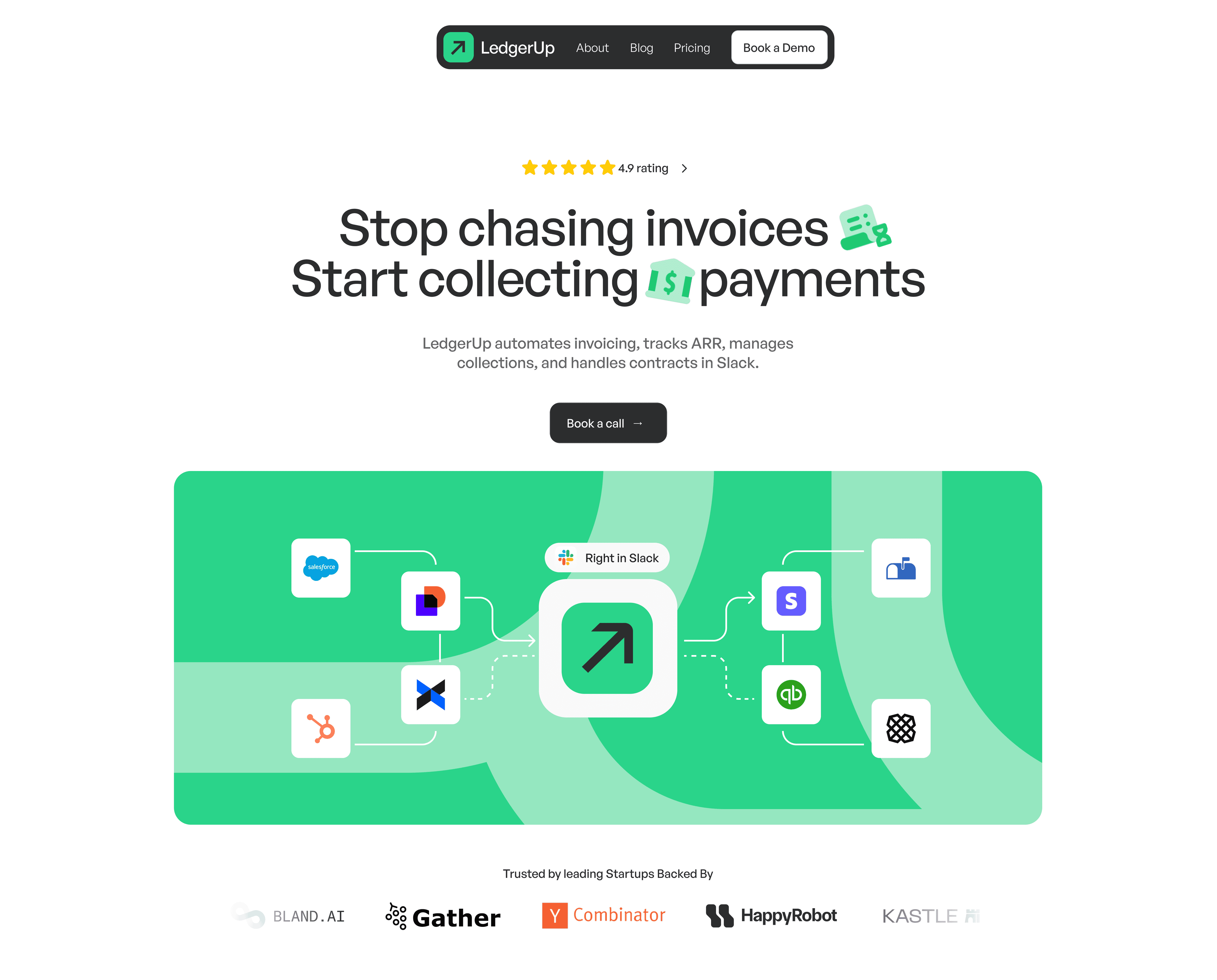
Background
LedgerUp is a Y Combinator–backed revenue operations platform that helps SaaS companies streamline their financial workflows. The team at LedgerUp needed help designing a new landing page from scratch while subtly enhancing their visual identity—bringing more clarity, confidence, and trust to their online presence.
Role
Designer and Developer
Team
2 product designers
Timeline
2 weeks
The problem
LedgerUp’s existing site lacked clarity and credibility. It didn’t effectively communicate what the product does or why it matters—especially important for a platform handling sensitive financial operations. The site also lacked a clear value proposition, core values, and a cohesive vision to guide potential users.
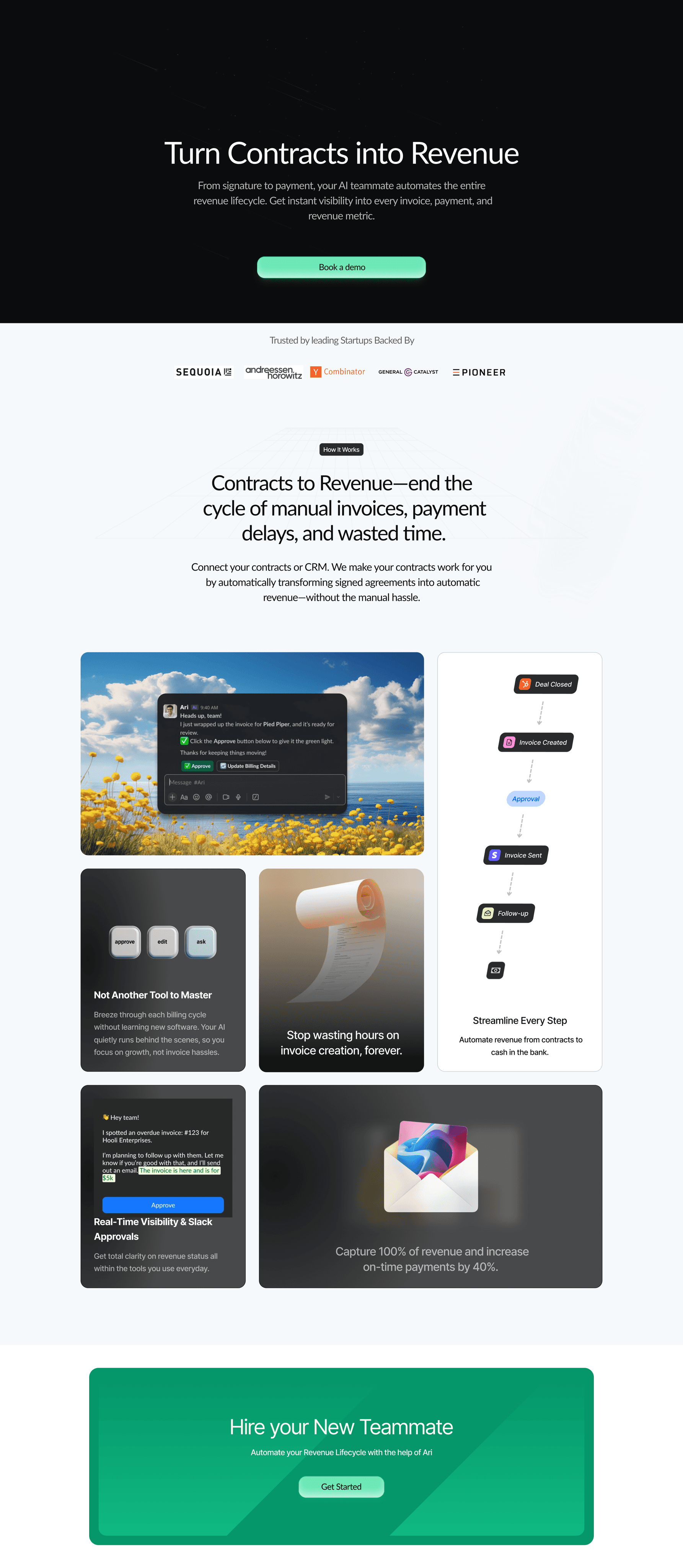
LedgerUp's existing site
Process
Initial research and defining company values
To better understand LedgerUp’s brand direction, I collaborated with the other designer on the team to analyze annotated interviews with key stakeholders. Through this research, we were able to define the company’s core values, vision, and brand narrative—creating a solid foundation to guide the design process.
Vision
"a world where every scaling company has an AI teammate handling revenue ops — so people can focus on work that actually moves the business forward"
Product statement
"Ari AI does one thing really well: take a signed contract, invoice someone for it, follow up until it’s paid — all in Slack"
Values
Relief
Trustworthy
Competent
Light
Creating the visual identity
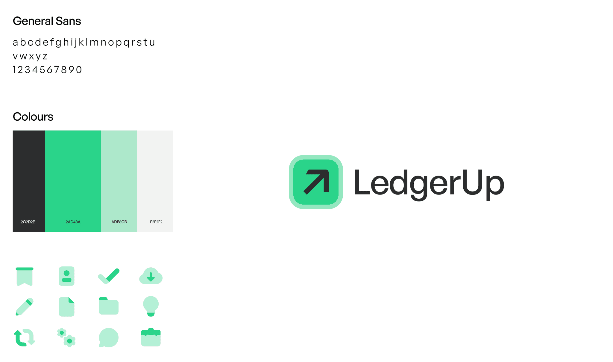
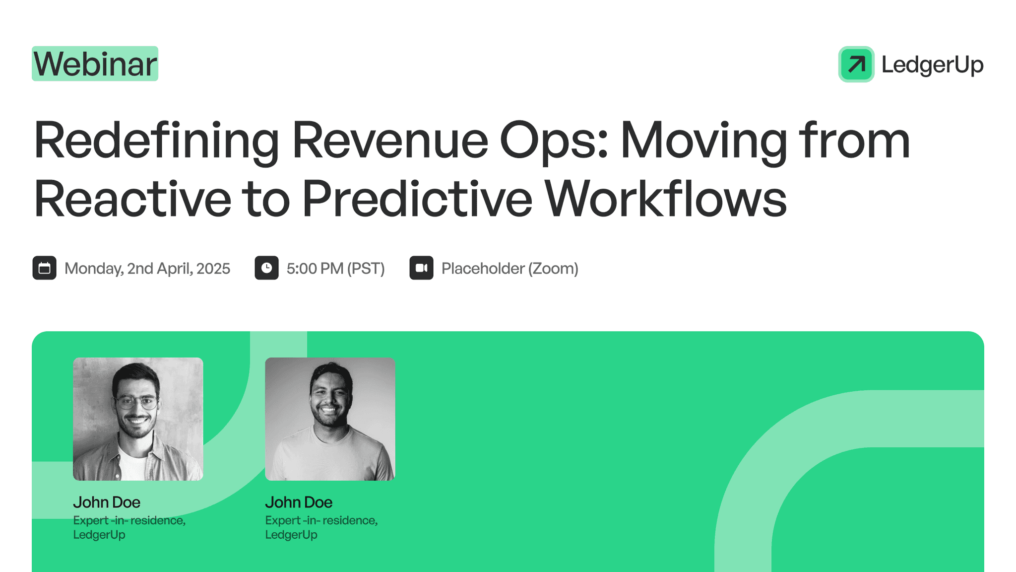
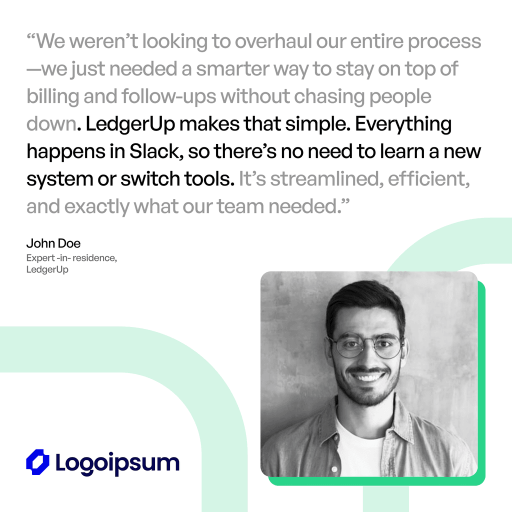
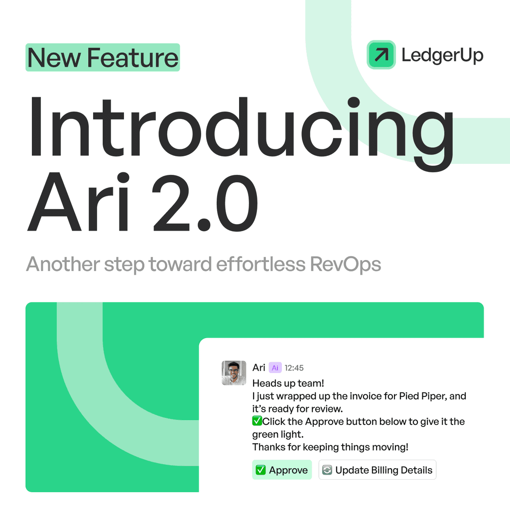
Once the company’s direction and target user group was clearly defined, we refreshed LedgerUp’s brand guidelines—establishing a refined color palette, updated typography, and a subtly improved logo to better align with its values.
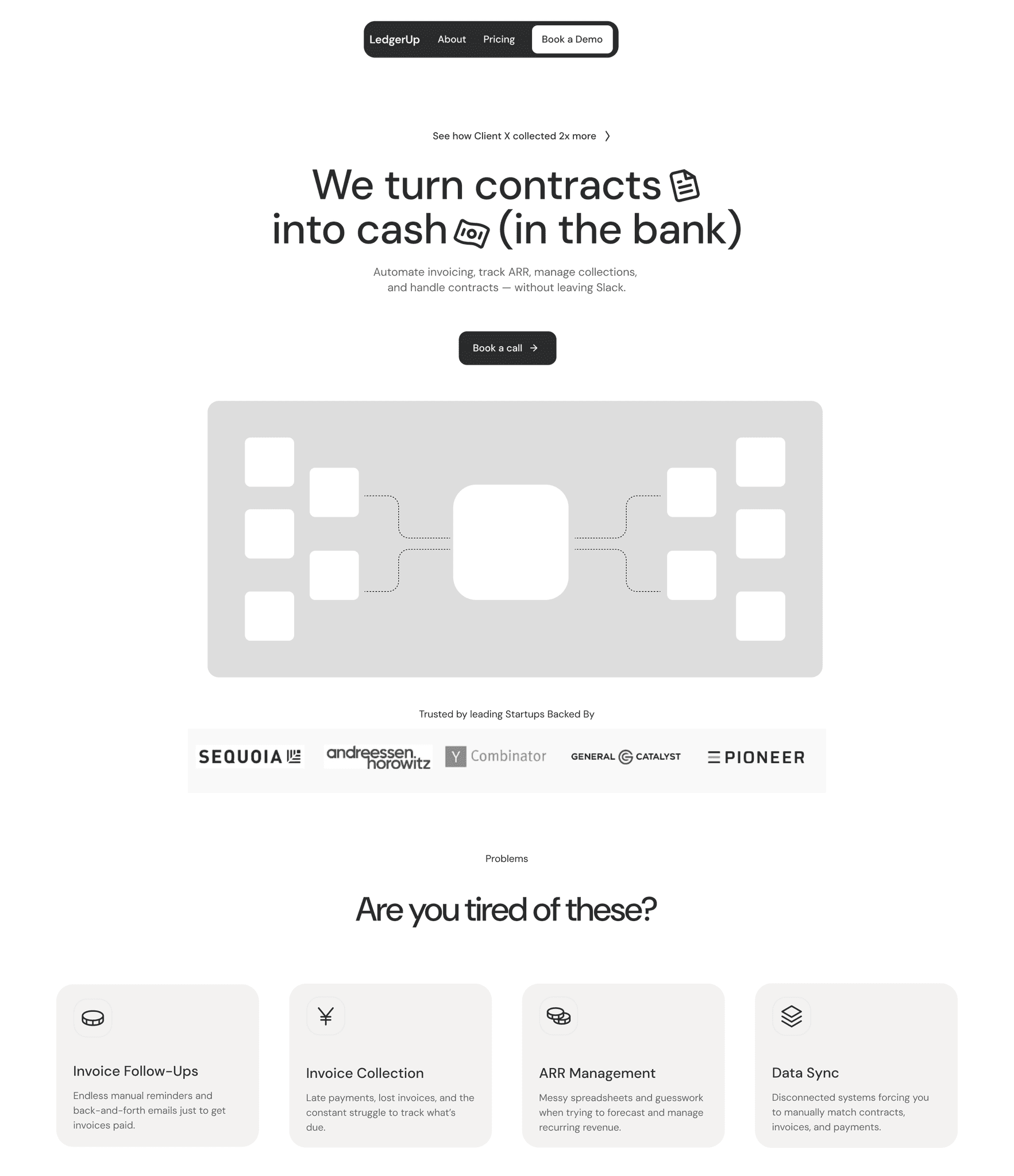
Coming up with early wireframes of the landing page
The other designer on the team created early wireframes for the landing page, along with draft content to communicate the product’s value clearly. These designs were regularly shared with stakeholders and iterated upon to ensure the messaging was aligned and effective.
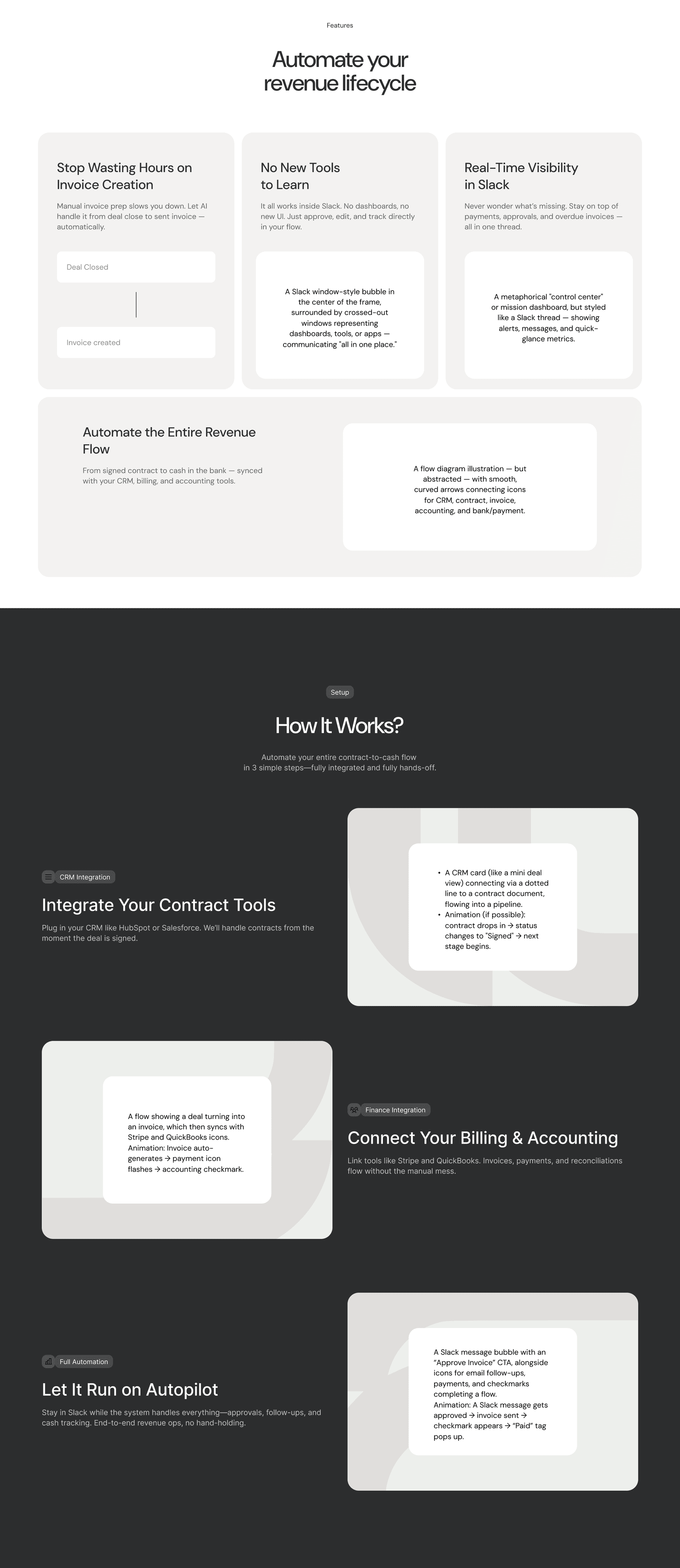
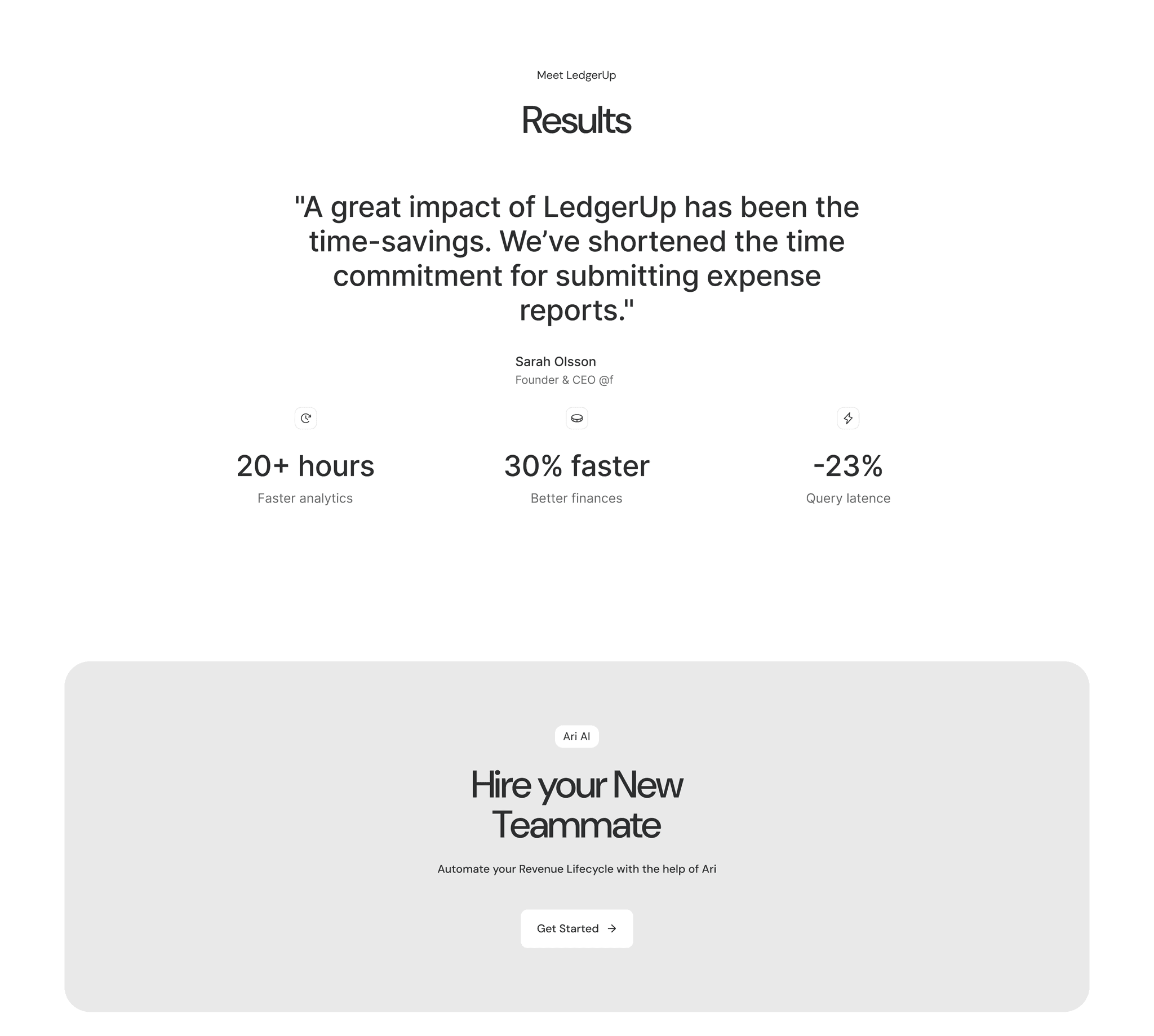
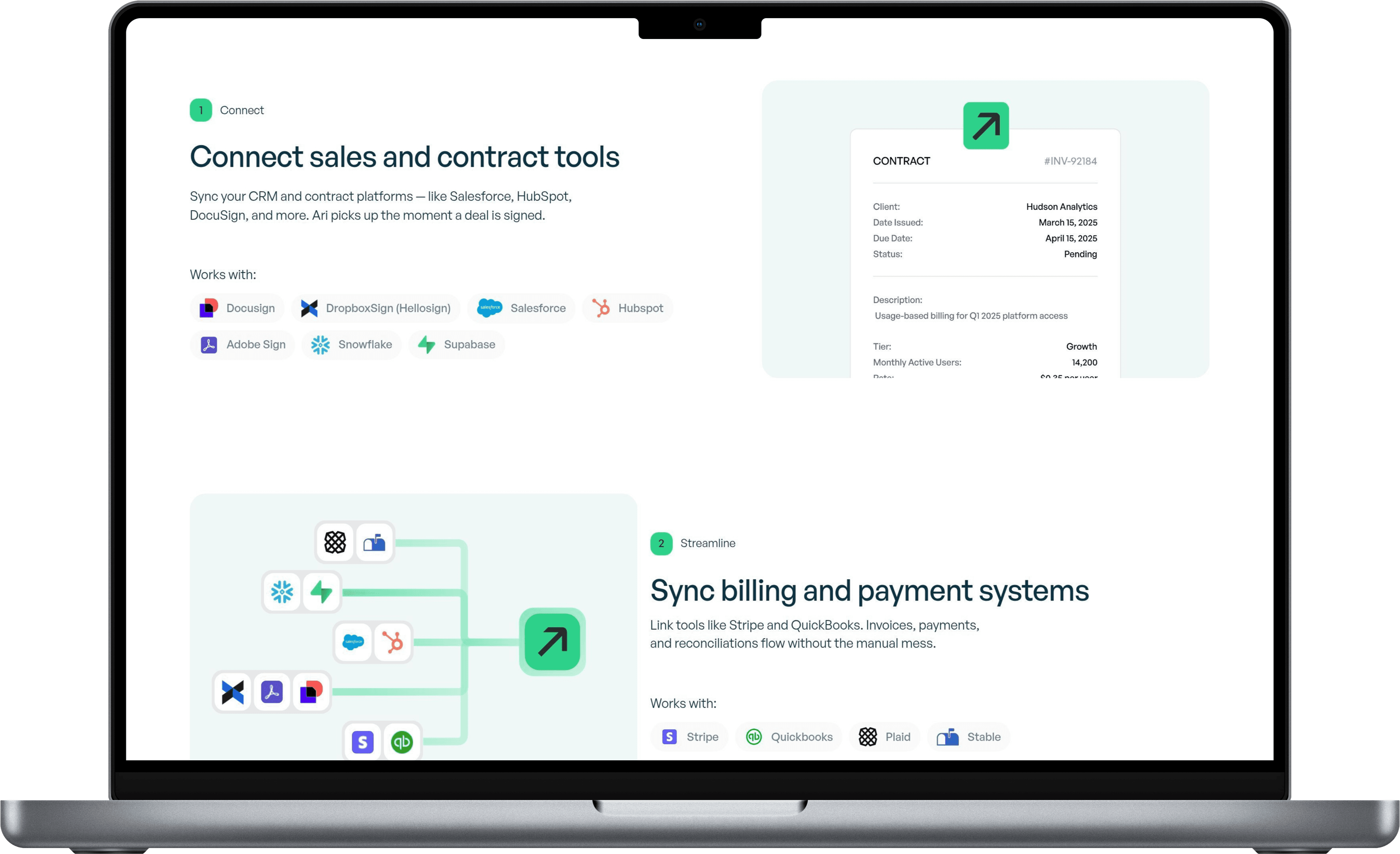
A key focus during this early wireframing stage was guiding users to understand the core problem companies face with revenue operations—while clearly communicating how Ari, their RevOps AI agent, solves it well by taking a signed contract, invoicing for it, and following up until it’s paid—all within Slack.
Creating animations
We realized that animations would play a crucial role in conveying both the problem and the product’s functionality. Since LedgerUp’s AI agent, Ari, operates entirely within Slack—without a traditional dashboard—it was difficult for users to visualize how their revenue operations would be managed. This lack of a distinct interface, while a key part of the product’s USP, made it challenging to communicate its value. Animations helped bridge that gap by visually explaining how Ari works.
Although I had never created animations before, I took on the challenge as a learning opportunity. Using an online tool called Jitter, I ideated, animated, and implemented a series of motion elements directly into the design to bring the product story to life.
Framer development
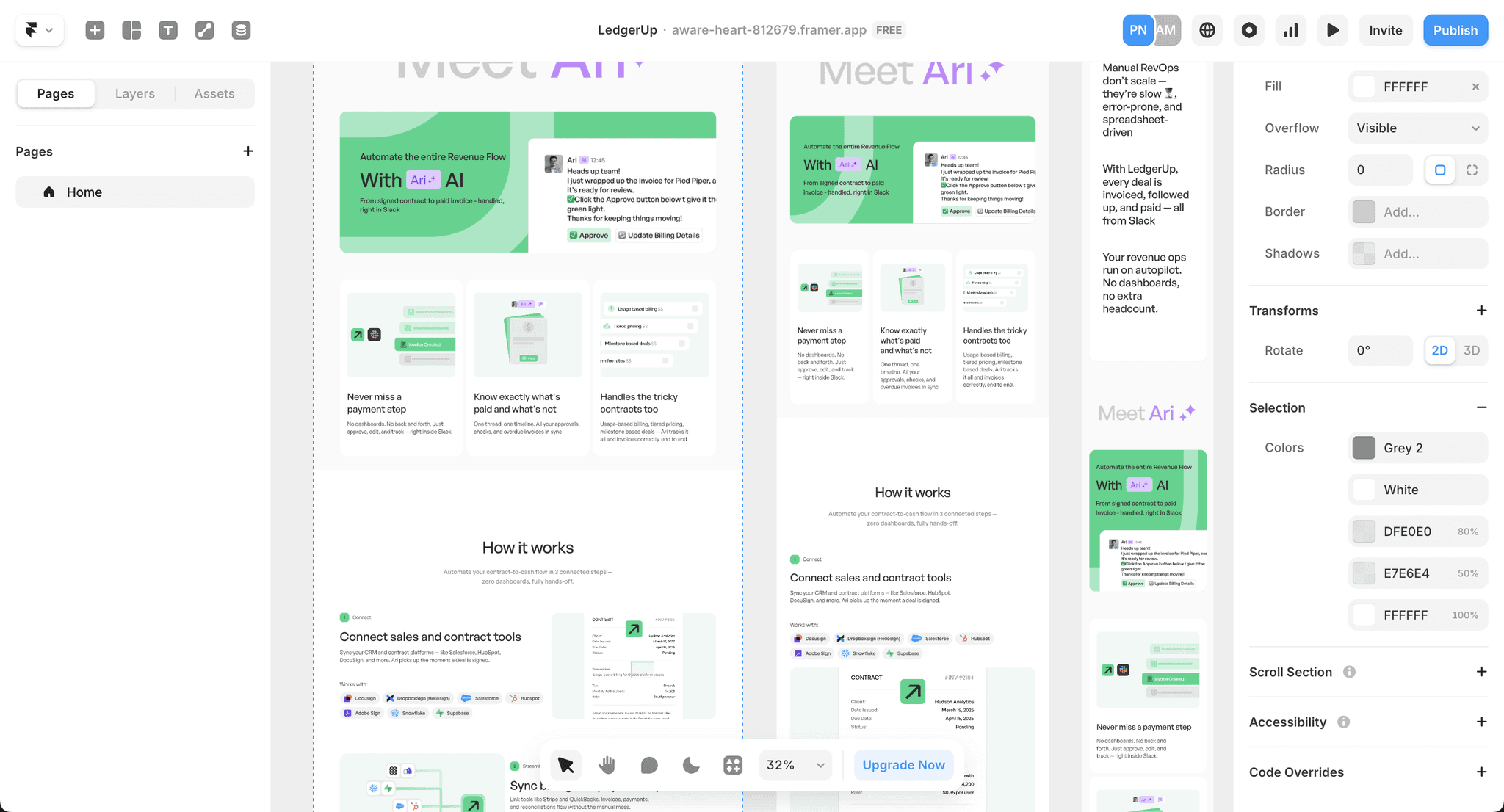
Once the client approved the Figma designs, I moved on to developing the site using Framer. Given the tight timeline, I accelerated the process by starting with a Framer template that closely matched our design direction. I then customized pre-made components to align with our visuals. This approach significantly reduced development time, allowing more room for polish, final tweaks, and bug fixes.
Handing off the finished product
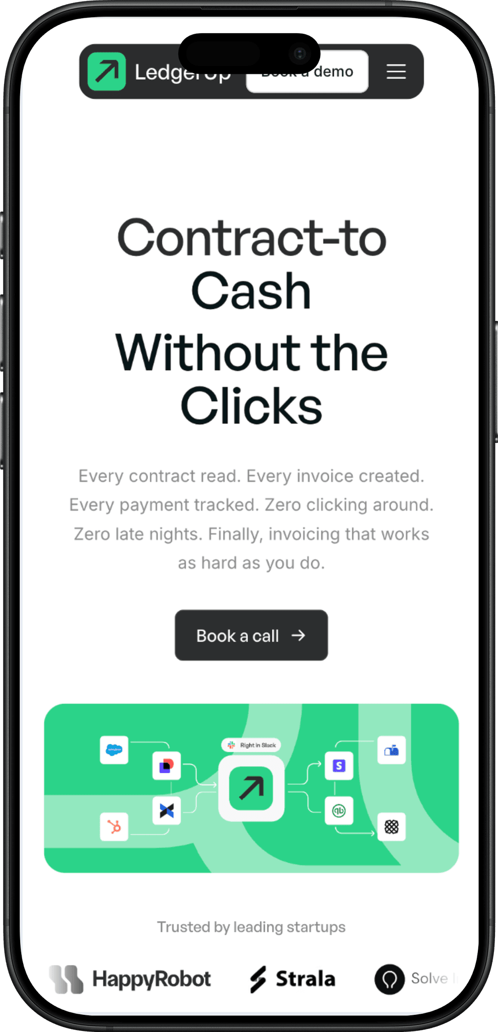
After what felt like an intense two-week sprint, we successfully researched, designed, animated, and developed a fully functional landing page that brought LedgerUp’s vision to life. The new site not only clarified the product’s value but also built trust with potential customers through thoughtful visuals and clear messaging. By launch, the team saw an immediate boost in sales and engagement.
Reflection
This project was my first time stepping beyond the traditional scope of designing within Figma and then handing it off. Taking the lead on development and creating animations from scratch pushed me out of my comfort zone—and doing so for a YC-backed company that manages millions in customer revenue made the stakes feel especially high. It was a challenging but incredibly rewarding experience, and I knew I had to get it right.
One of my biggest takeaways was the importance of involving clients and users early in the design process. In hindsight, I could have saved hours of work by sharing rough concepts sooner instead of waiting until I had more polished designs. Early feedback is powerful—it aligns expectations, saves time, and leads to smarter design decisions.