Background
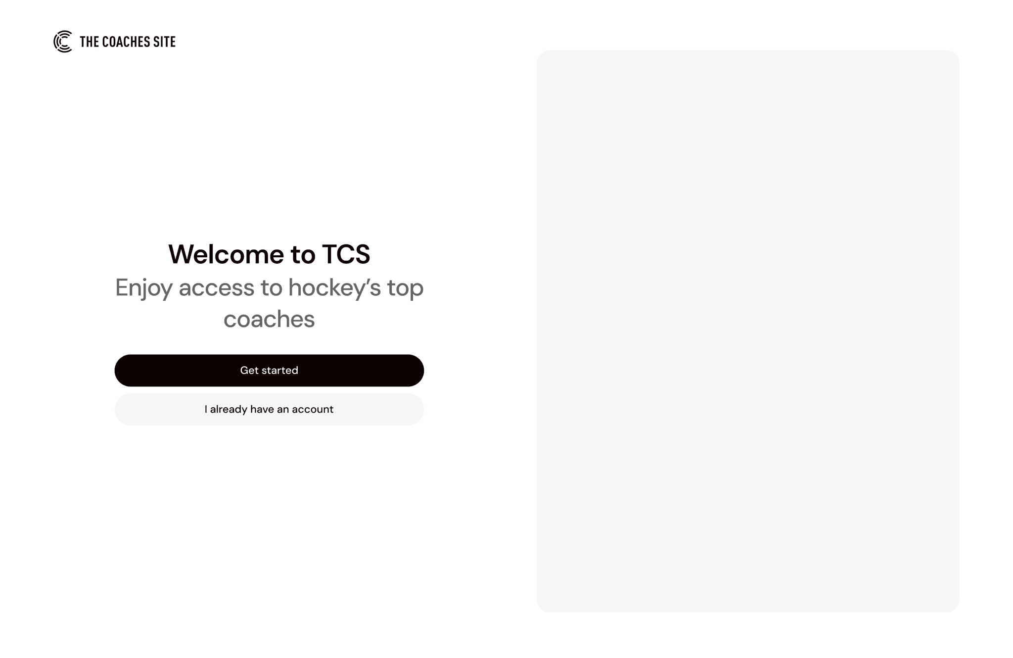
The Coaches Site is an online platform for hockey coaches worldwide to access, share, and organize video content and coaching resources. During my final semester in university, I got the opportunity to work with their team to help improve their product. One of the features I worked on was their new user onboarding, which was in need of a complete revamp.
Role
Product Designer
Team
Solo designer
Timeline
1 month
My contribution
As the design lead, I structured and managed all project deliverables and timelines, while also facilitating collaboration between the tech, sales, and product team. I conducted UX research with users, ran usability tests, and translated insights into wireframes and design solutions.
The problem
The Coaches Site is facing low engagement during the onboarding process, resulting in reduced task completion rates and limited user data collection. Because users must complete onboarding to fully access the platform, early drop-offs prevent them from experiencing the product’s core value (the content). This also hinders the platform’s ability to personalize content for different user types—coaches, players, and parents.
Notably, 40% of users create an account but never return after their first visit.
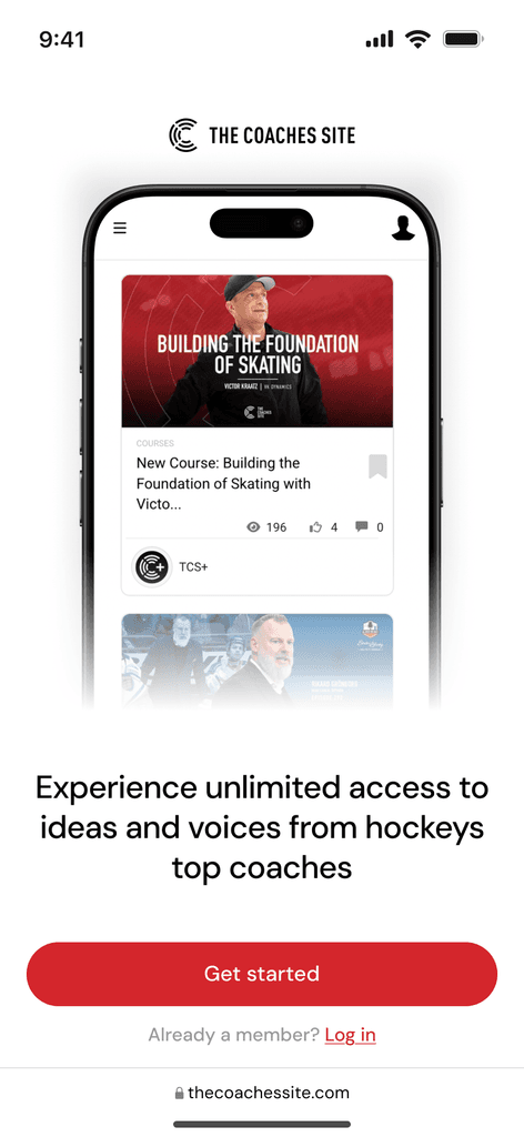
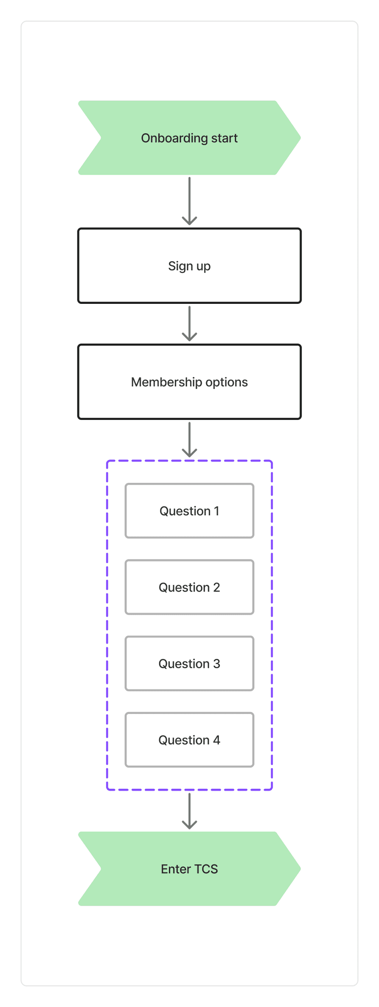
TCS's existing onboarding
Process
Improving my understanding of the product and it's users
To improve my understanding of the product and it's users, I conducted recorded interviews with employees. Insights from these discussions, along with data from Hotjar, helped clarify the composition of the user base and informed the direction of future UX research.
The platform's primary user segments consisted of :
60%
Career / Association coaches
20%
Parents
12%
Players
Talking to users
With a clear understanding of the core user groups, I tested the existing onboarding flow with users who matched those demographics. Key insights from these sessions included:
The onboarding felt too information-heavy and overwhelming
Users didn’t believe it would meaningfully impact their platform experience
It came across as transactional rather than welcoming
Many users struggled to understand the platform’s core value
70% of users incorrectly assumed they needed to pay to continue using the platform after the 10-day trial
Screenshot of UAT Session
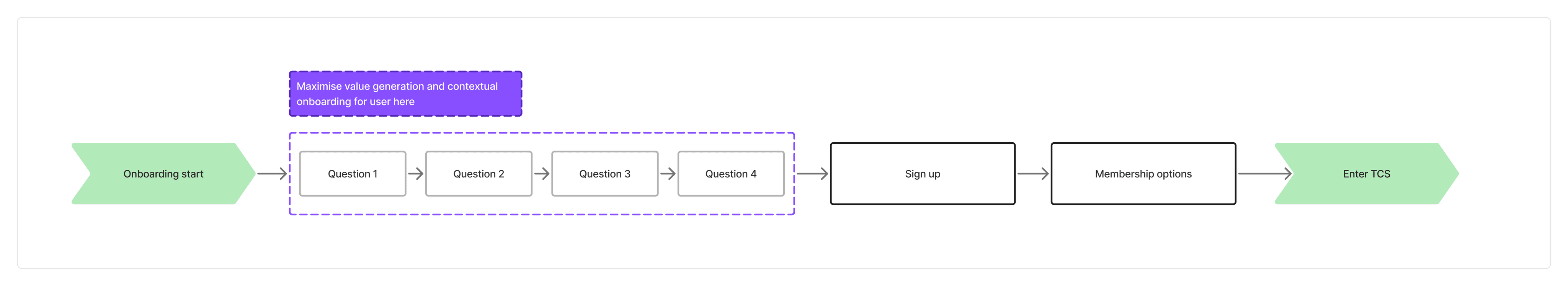
Rethinking the overall onboarding flow
After gathering insights from user testing and analyzing onboarding patterns across other platforms, it became clear that The Coaches Site needed more than a few tweaks—it needed a restructured onboarding experience from the ground up.
One key principle drove this decision: Reciprocity. Users are far more likely to share their time, information, or even money if they feel like they’re getting something of value first.
In the case of TCS, that meant shifting the onboarding from a transactional checklist to an experience that clearly showed users how the platform could benefit them—before asking for anything in return.
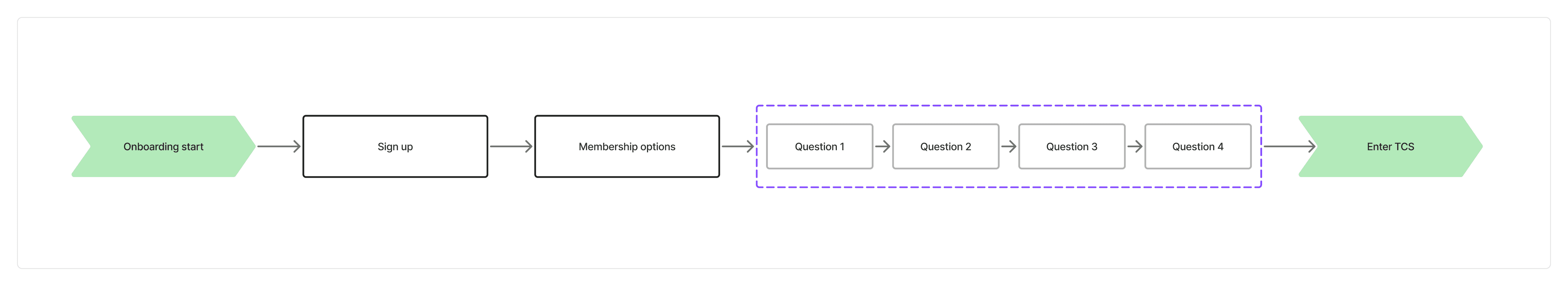
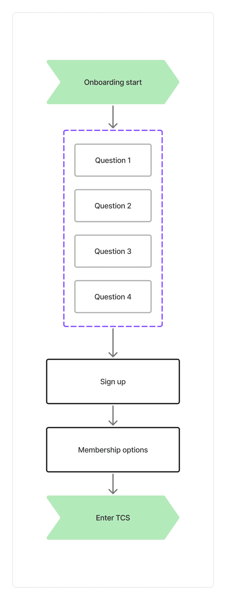
Mapping out updated questions and early wireframing
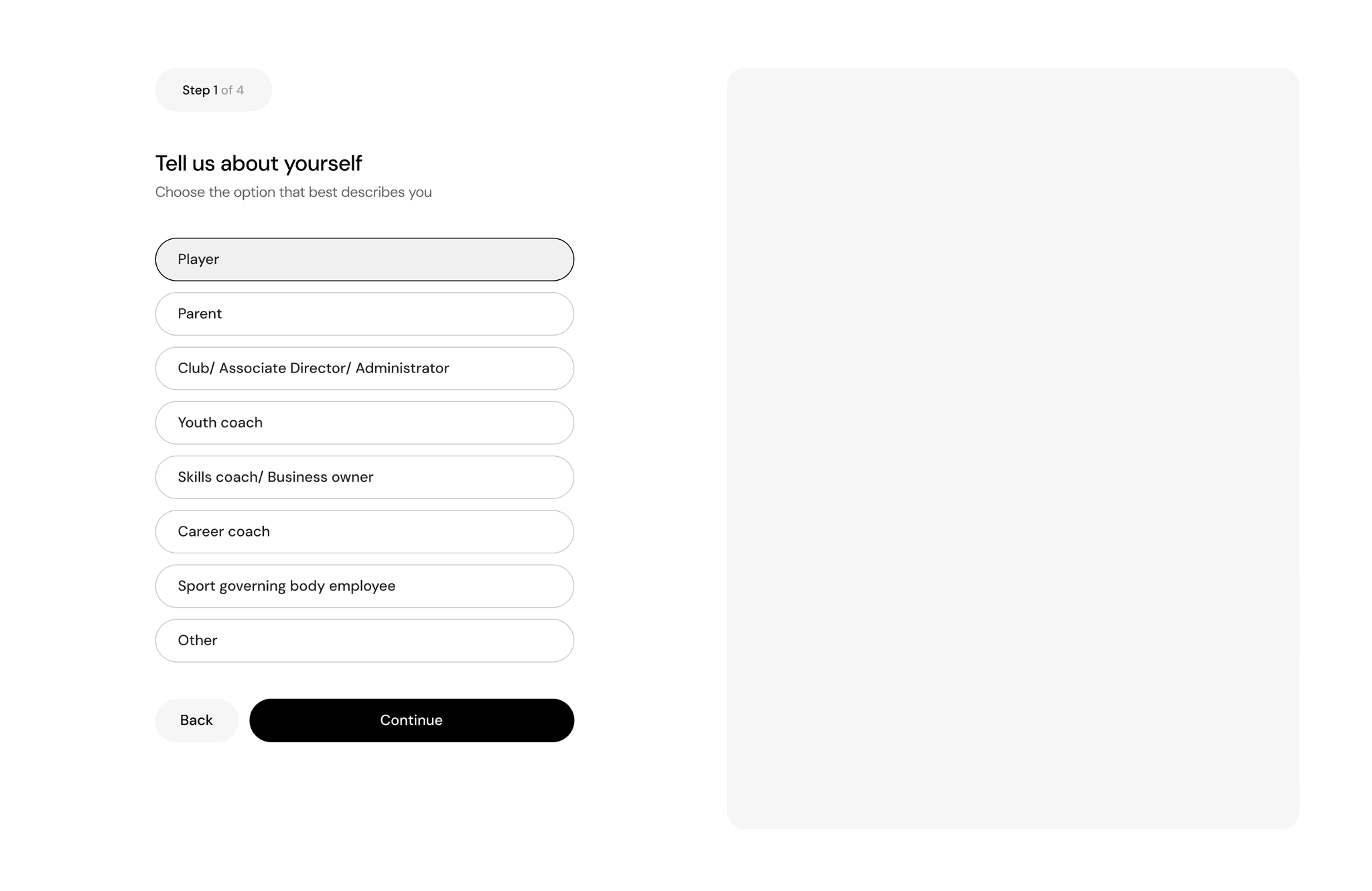
Guided by the principle of showing value first, I quickly sketched early wireframes while also refining the onboarding question flow. The goal was to ensure that every key user group—whether a coach, parent, or player—felt the platform had something meaningful to offer them from the very beginning.
Mapping out onboarding questions
Solutions
SOLUTION 1
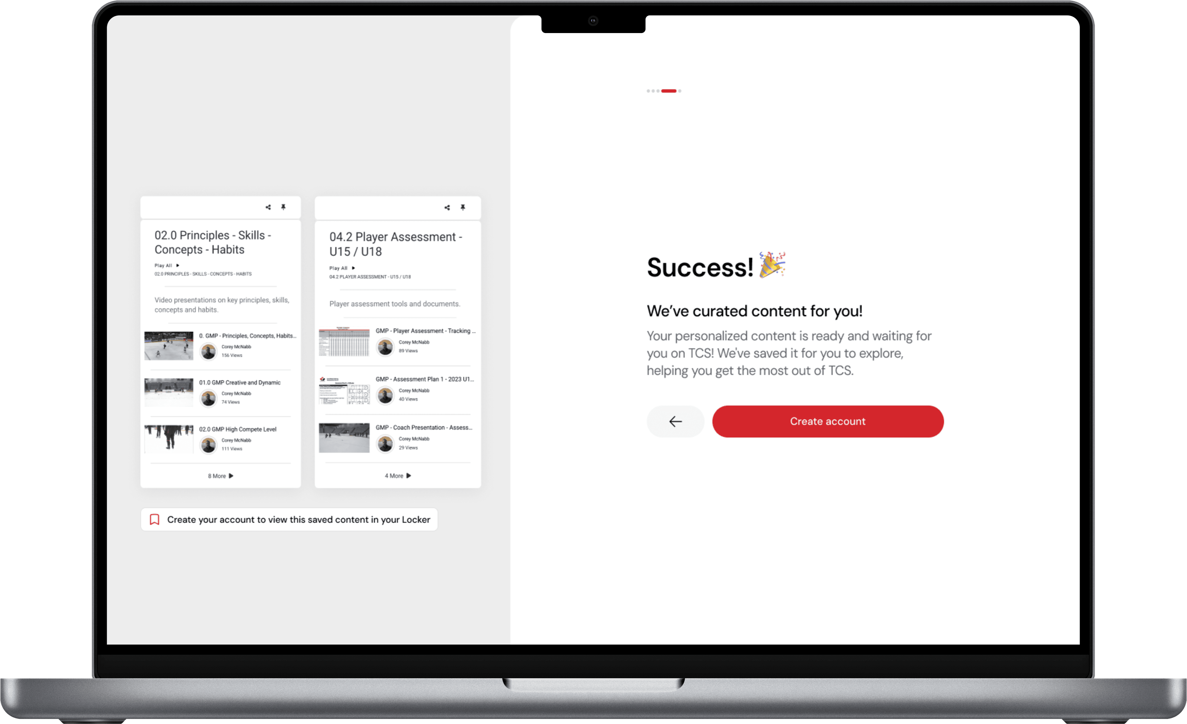
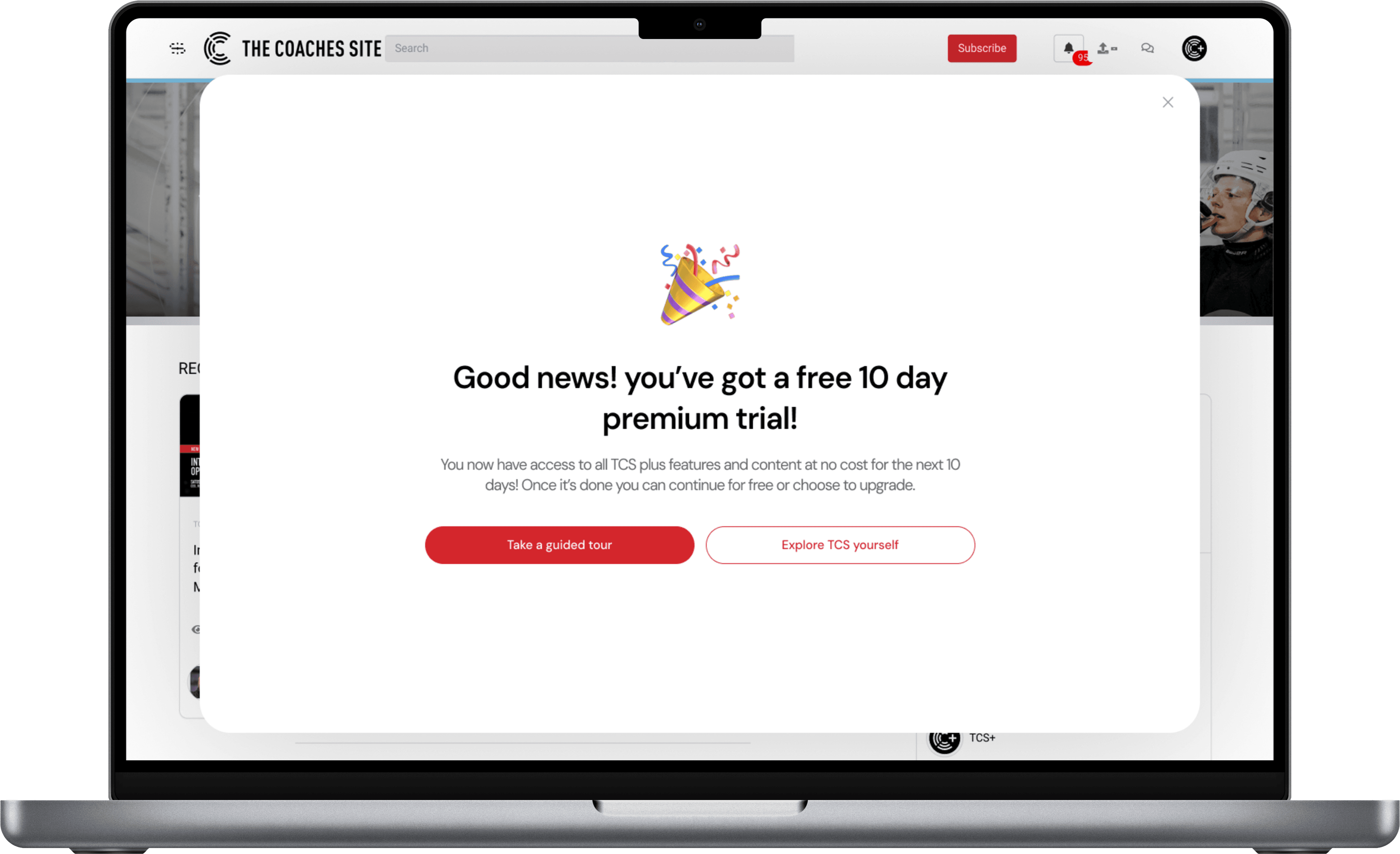
Showcasing curated playlists (Lockers) to users
The final screen of onboarding previews a personalized playlist—a curated set of videos based on the user’s role and preferences. This playlist is created on their account and becomes available once they sign up.
It gives users a clear, immediate reason to complete onboarding and reinforces that the experience was designed with intention—to personalize their journey and deliver content that truly matters to them.
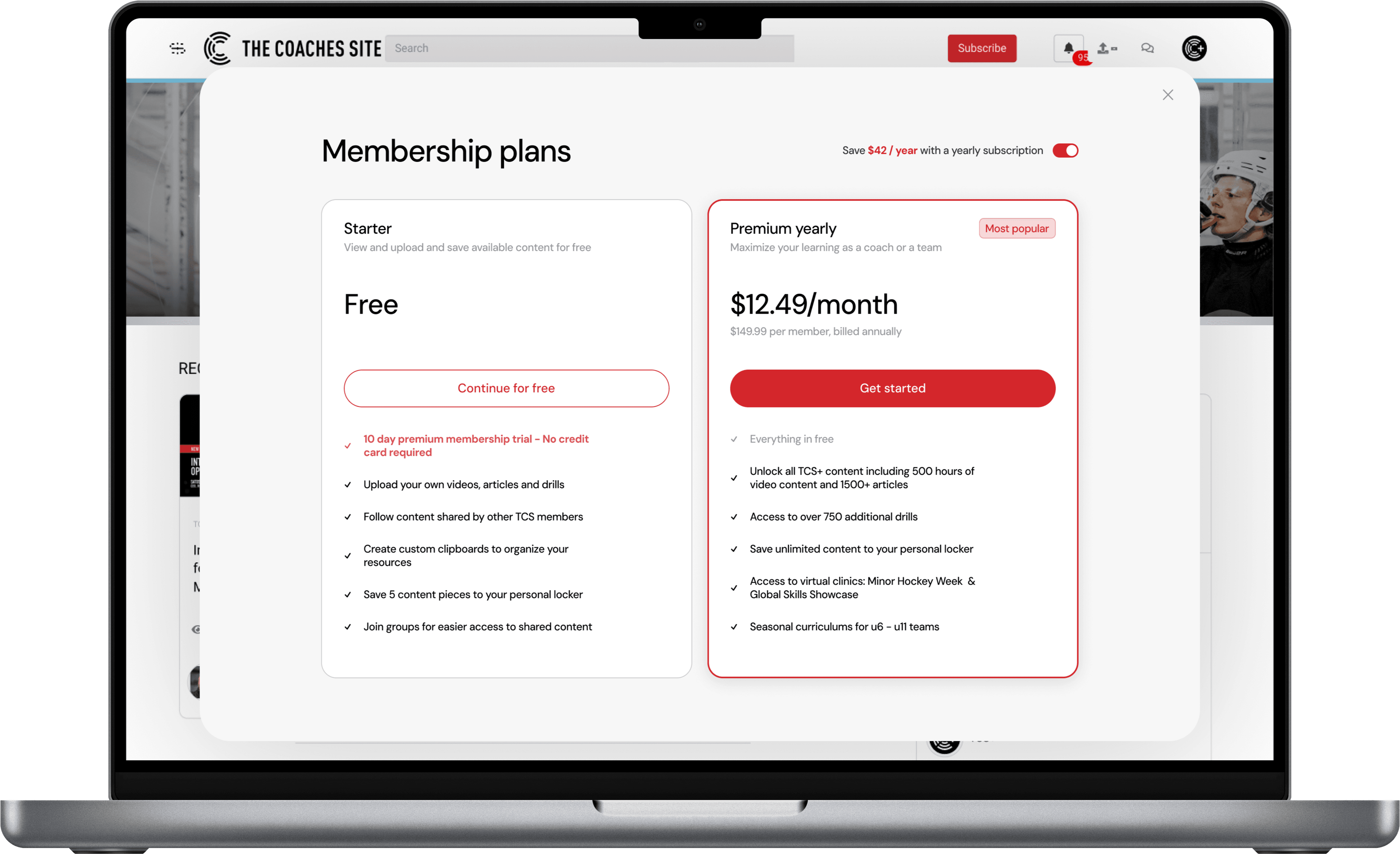
SOLUTION 2
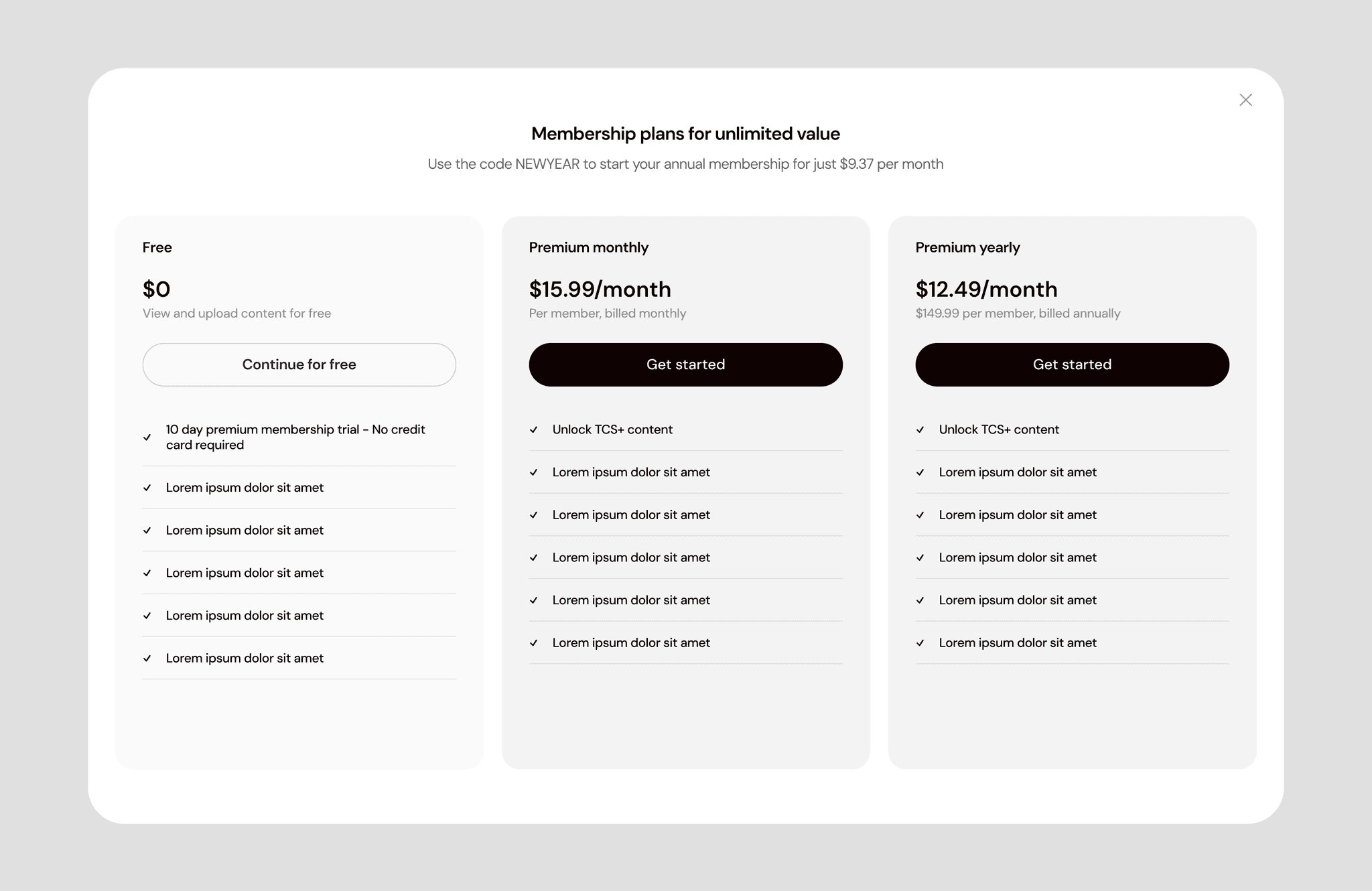
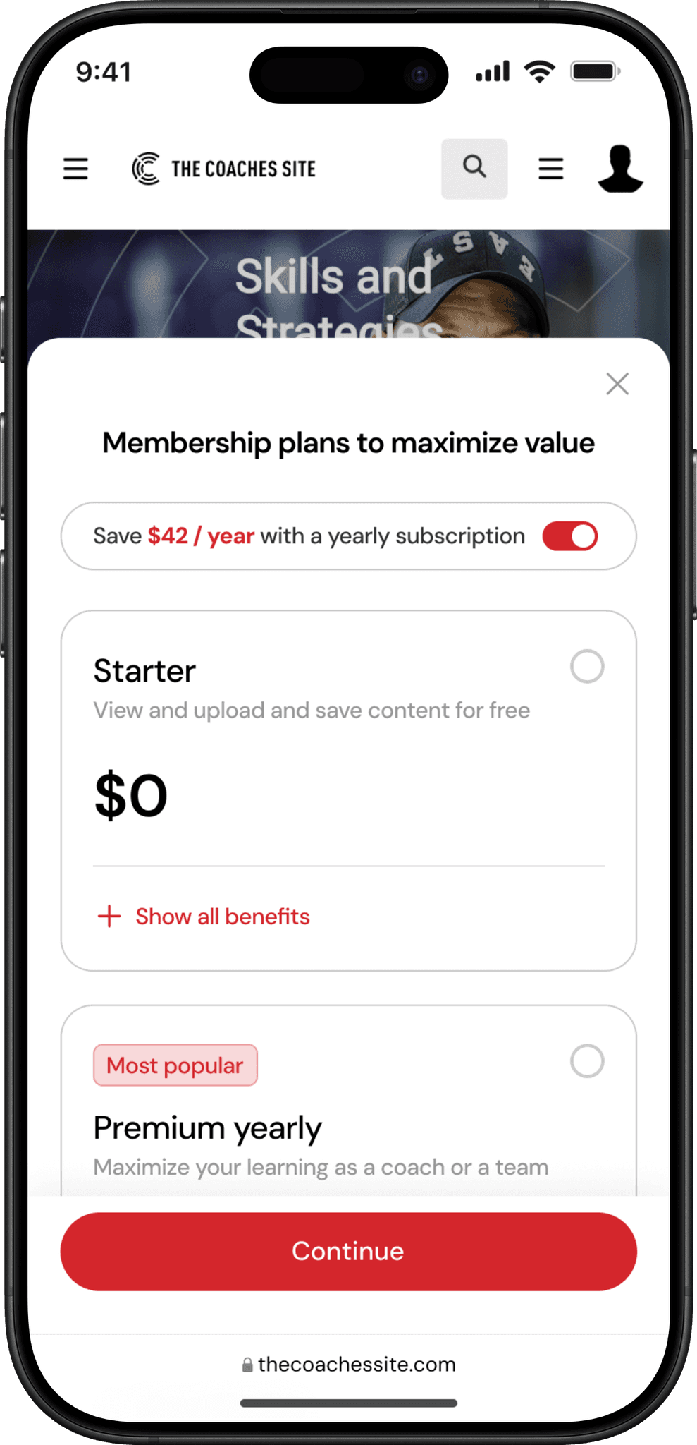
Updated membership screen
To address confusion around platform functionality—and the misconception that it was entirely paywalled—the membership screen was redesigned. Each membership tier is now clearly differentiated, with a breakdown of included features. A toggle was also introduced to let users switch between monthly and yearly plans, promoting the annual membership.
SOLUTION 3
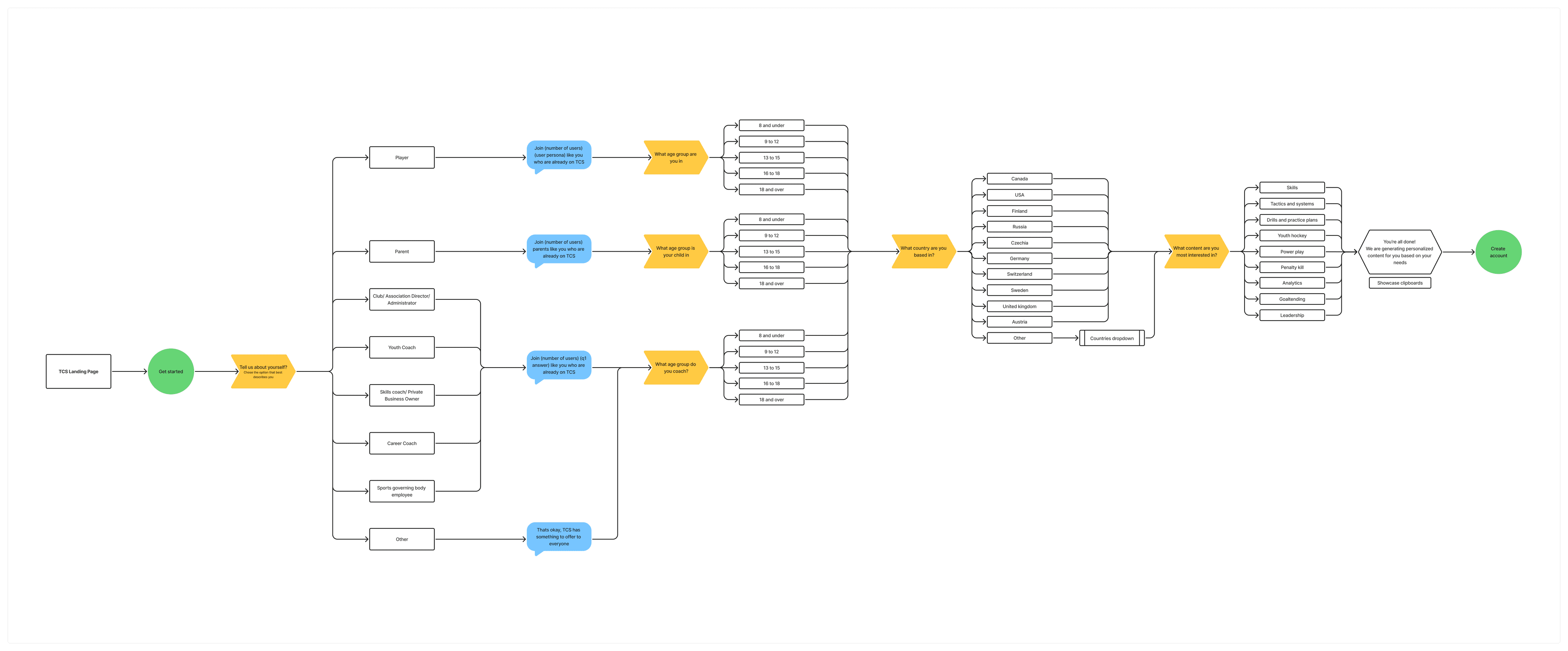
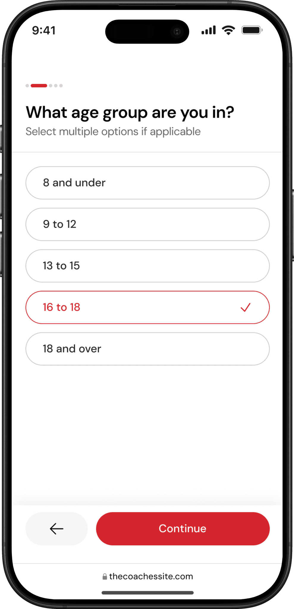
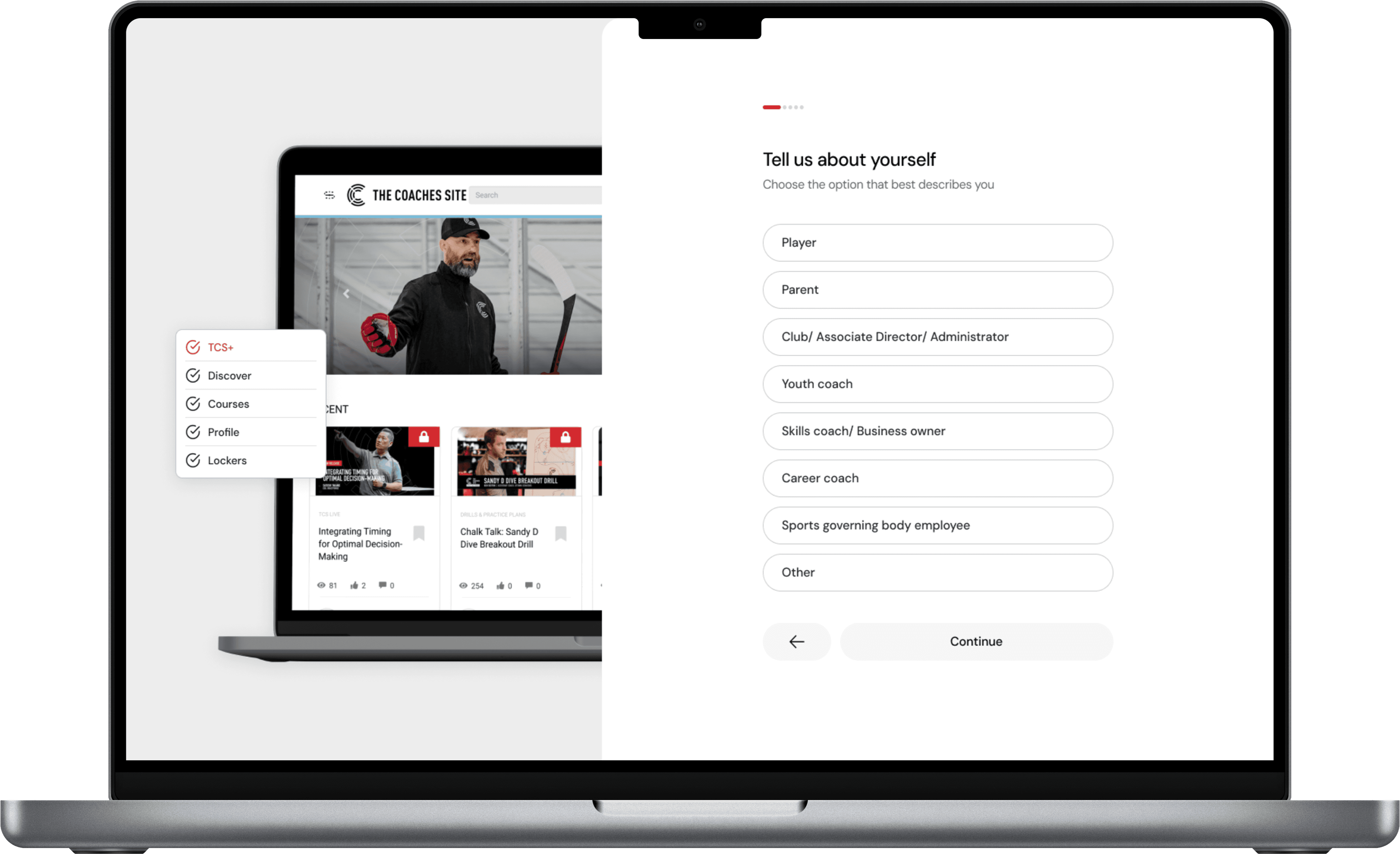
Personalized questioning
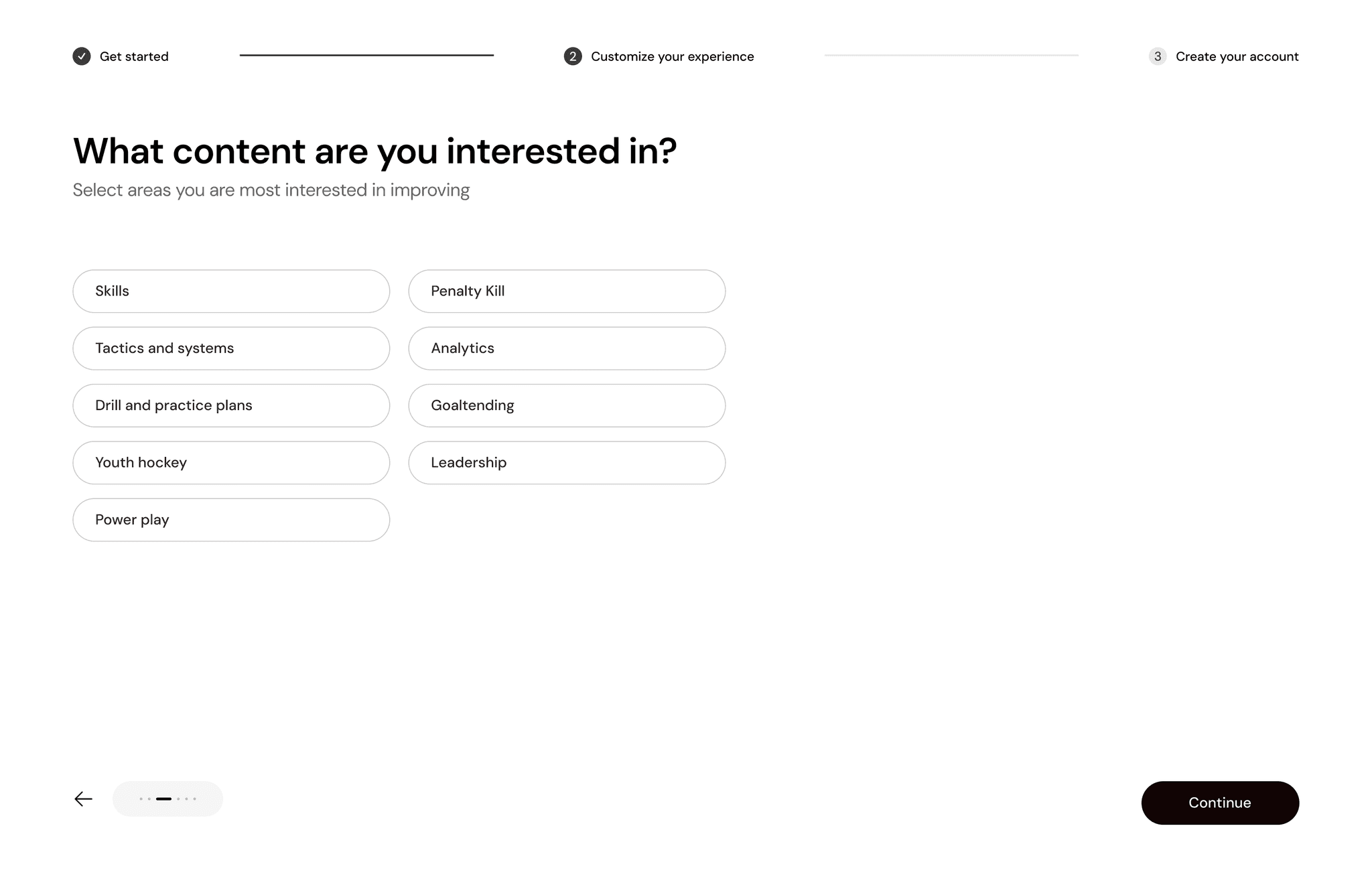
To make the onboarding experience feel more relevant and tailored, we adapted questions based on the user’s role—coach, player, or parent. While the core intent remained consistent, the framing and language shifted to match each group’s needs and expectations. This approach helped convey that The Coaches Site offers value to everyone involved in hockey, right from the start.
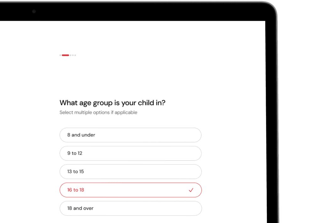
Parent onboarding
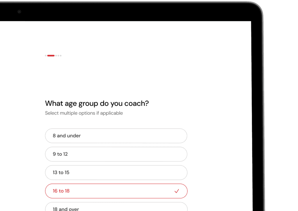
Coach onboarding
Handing off the finished product
In the final stage, I delivered both mobile and desktop screen designs to the development team, ensuring they had everything needed to integrate the updated onboarding experience into the existing product and begin implementation.
Reflection
Working on TCS’s onboarding was my first experience designing a full onboarding flow. Beyond learning best practices, I realized how crucial it is to clearly define the problem early on. Having measurable outcomes—like task completion and retention rates—gave me a clearer sense of how to evaluate design success.
A major takeaway was the importance of cross-team communication. Early in the project, misalignment between tech, sales, and product teams caused delays. Acting as a bridge between them and driving design decisions helped bring clarity and unify the vision.